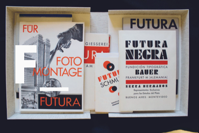
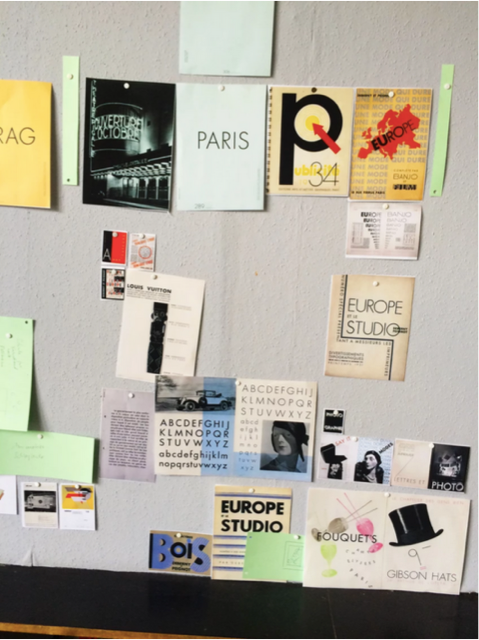
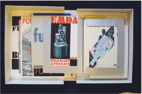
In 1927, typographer Paul Renner (1878–1956) designed one of the most commonly used and emblematic typefaces of the 20th century. Futura was hyped as the »typeface of the future,« and became the spiritual artifact of the 1920s »New Typography,« enjoying a long existence as a relevant type long after the pre–World War II modern movement collapsed under the weight of Nazi oppression (although even they maintained a bastardized version). Futura survives as an embodiment of the avant-garde. »Accordingly, it determined the ‚modern‘ appearance of many print media, also shaping the look of large brand names,« write Isabel Naegele and Petra Eisele in a letter from Mainz, where three years ago they mounted an exhibition and eponymous book, Futura. The Typeface. This letter included a »small documentary« of the Futura fest.
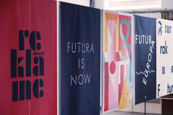
Those lucky enough to have been at the 2016/2017 exhibition at the Gutenberg-Museum Mainz, and at the Mainz University of Applied Sciences where Naegele and Eisele teach and research at Designlabor Gutenberg, hold that memory. For the rest of us, there’s the website Futura. The Typeface, where you’ll find five symposium translations and excerpts from the catalog. Then visit Type-trap, an interactive experience, »the largest search for [the] Futura typeface« on everything around the world (click »start« on the right), and a forum to discuss the findings.