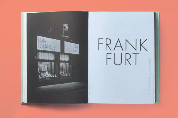
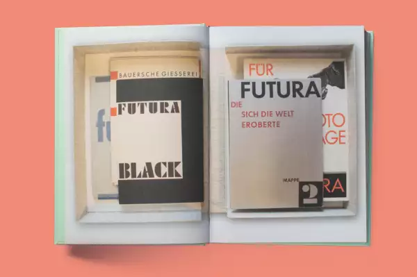
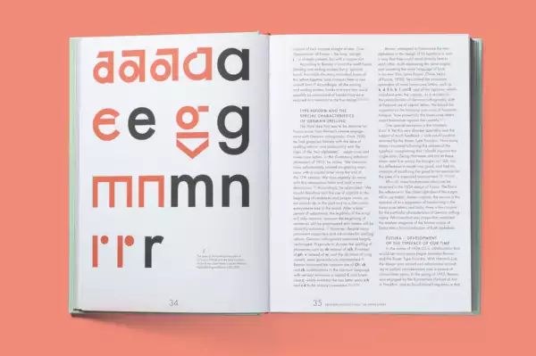
FUTURA. THE TYPEFACE. Now available in English.
Like no other typeface, Paul Renner’s FUTURA has shaped ideas of modernity and the future. It was the only sans serif typeface that was cut and produced in all figures, degrees and sets. Created in the second half of the 1920s, the typeface began its international success, first in Germany and then rapidly internationally.
What was and is the secret of the success of this typeface, which, in different times and different – also political – cultures, has been adapted again and again, is still widely used and known today? With contributions from:
- CHRISTOPHER BURKE
- UTE BRÜNING
- CARINA DANZER
- PETRA EISELE
- STEVEN BRIGHTER
- KLAUS KLEMP
- IVA KNOBLOCH
- ANDREAS COOP
- ANNETTE LUDWIG
- ISABEL NAEGELE
- MICHEL WLASSIKOFF
- ERIK SPIEKERMANN &
- FERDINAND ULRICH
FUTURA. THE TYPEFACE.
Edited by Petra Eisele, Annette Ludwig and Isabel Naegele.
Design: Stephanie Kaplan, Isabel Naegele
520 pages with countless color illustrations and font samples,
size 17,3 x 24 cm
Thread-stitched hardcover with foil embossing
and silver head cut
Laurence King Publishing London
ISBN 978-1-78627-093-1
Awards:
- Certificate of Typographic Excellence Type Directors Club Tokyo 2018
Fotos: Christopher von Zwehl
Further information is available at:


